

Te Pānui Rūnaka magazine

Te Karaka 93 – Kahuru/Autumn 2024
Defign 2024 mag, Architectural Designers New Zealand

Te Karaka 92 – Makariri/Winter 2023

Te Karaka 91 – Raumati/Summer 2022/23
Defign 2023 mag, Architectural Designers New Zealand

Te Karaka 90 – Makariri/Winter 2022

Te Karaka 89 – Raumati/Summer 2021/22

Te Rūnanga o Ngāi Tahu Annual Report – 2021
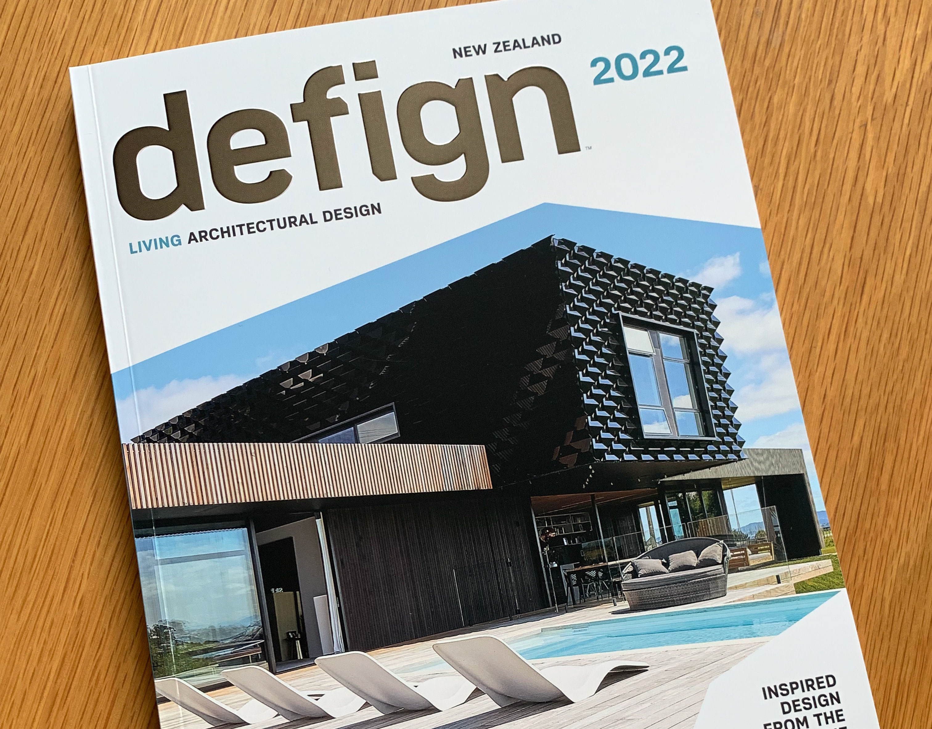
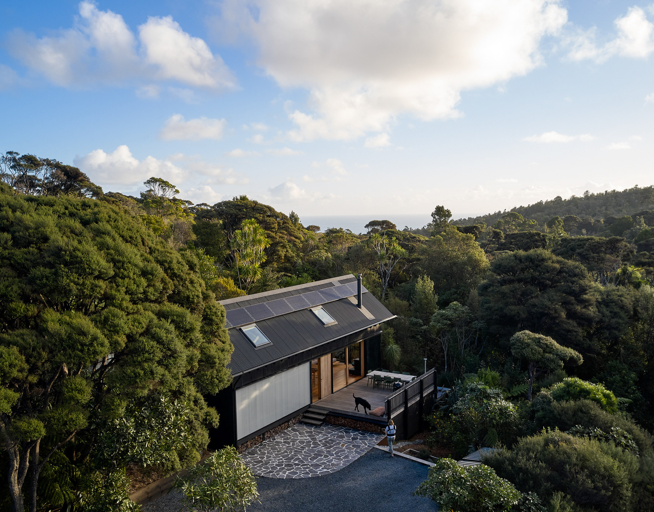
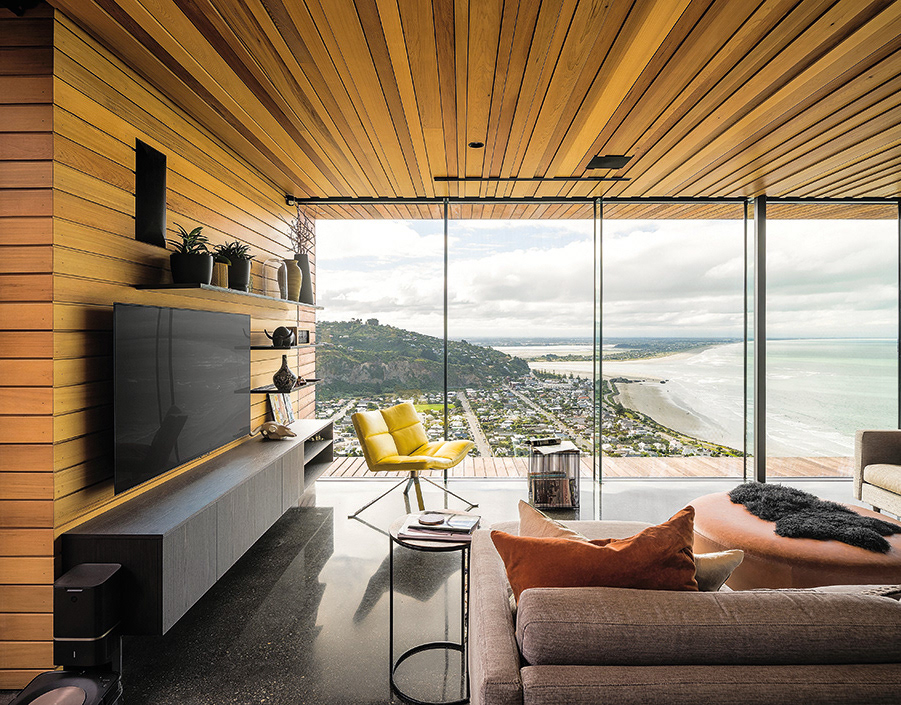
Defign 2022 mag, Architectural Designers New Zealand

Te Karaka 88 – Makariri/Winter 2021
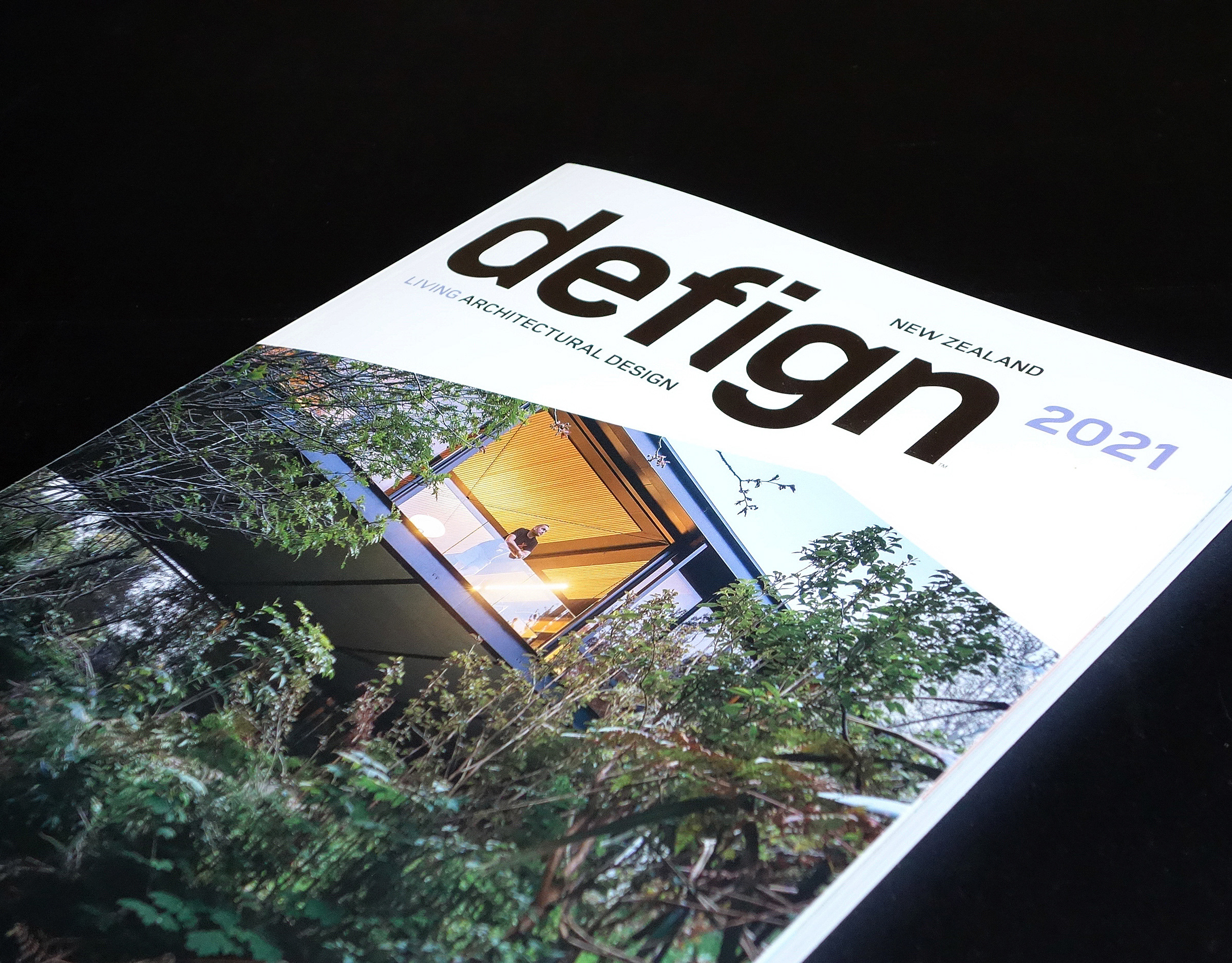
Defign 2021 mag, Architectural Designers New Zealand
Te Rūnanga o Ngāi Tahu Annual Reports – 2019 and 2020
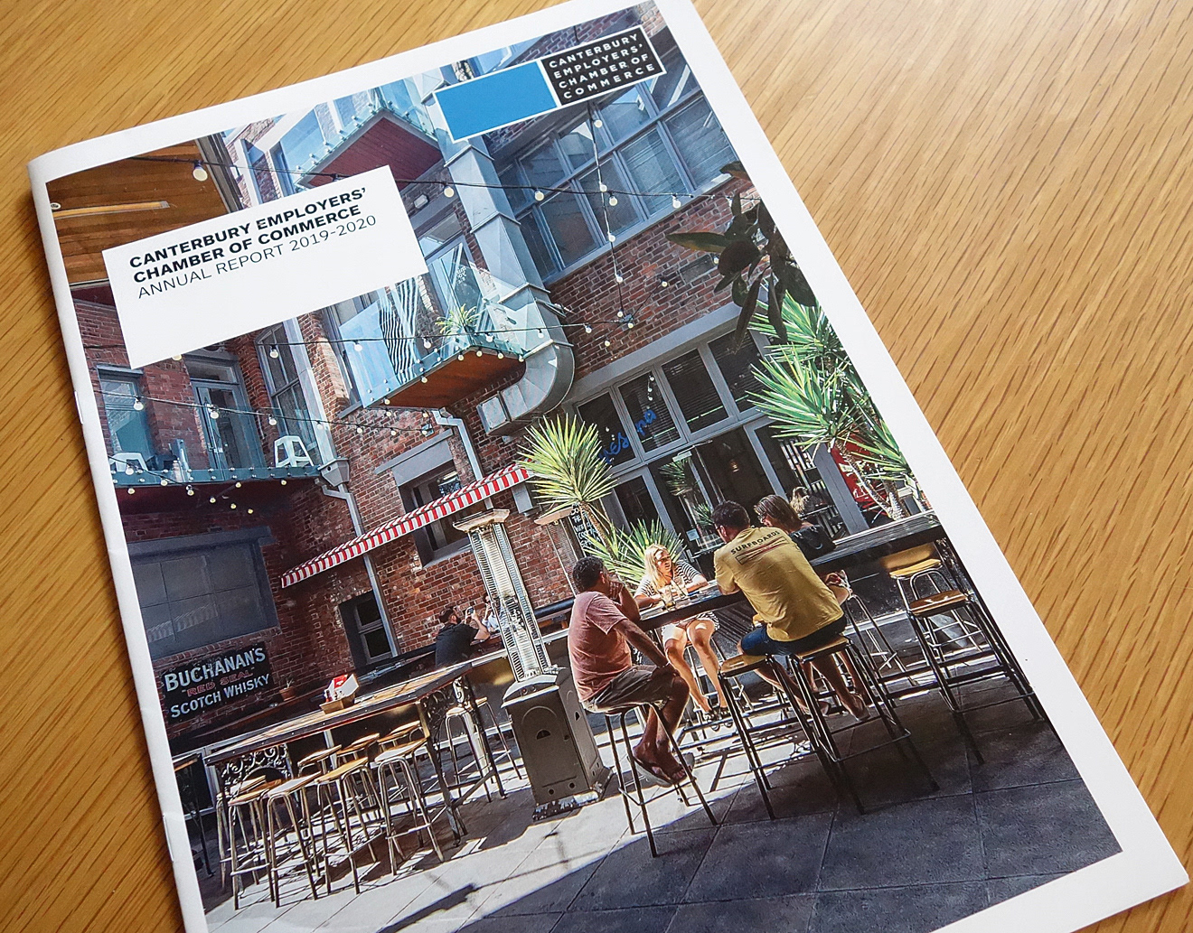
CECC Annual Report 2019-2020 + Business Champions 2020
CYCLES exhibition Tūranga, Christchurch Central Library
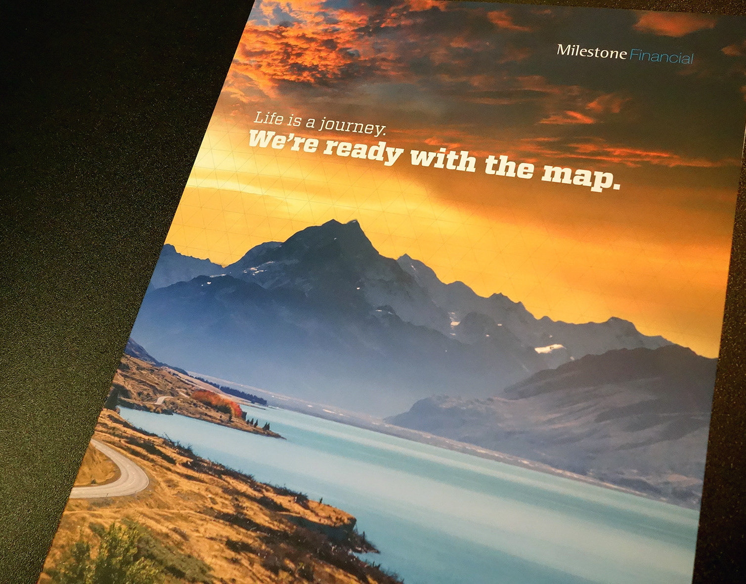
Milestone Financial Canterbury marketing collateral
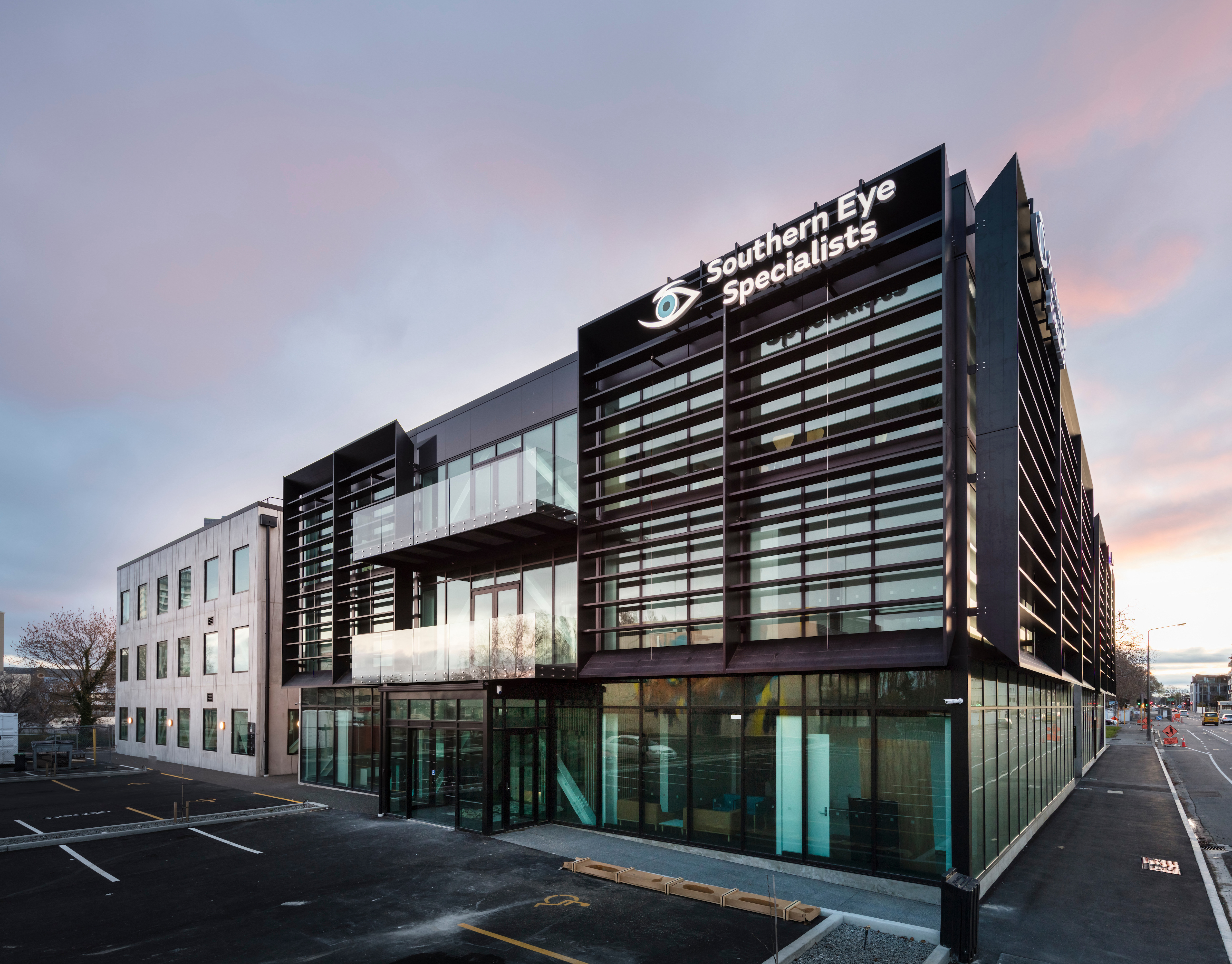
Southern Eye Specialists refresh and marketing
Update Q3 2019 business magazine from CECC

Defign 2020 mag, Architectural Designers New Zealand
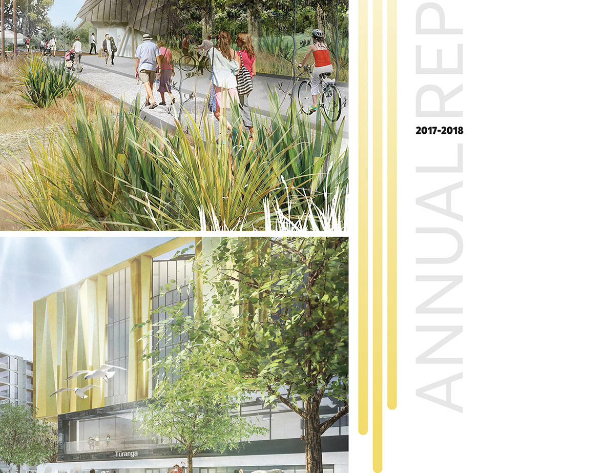
Regenerate Christchurch 2017-2018 Annual Report

2017 Waikato-Tainui Annual Report
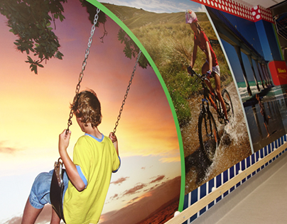
Child Haematology Oncology Centre wall graphics

Billboards and displays
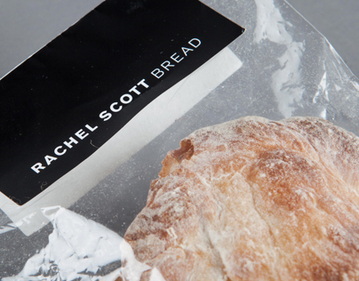
Rachel Scott Bread

Identities
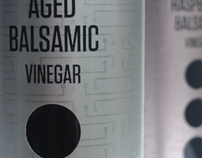
TasteMaker vinegar labelling

Posters

Bridgit Anderson Cyanotypes

St Albans School
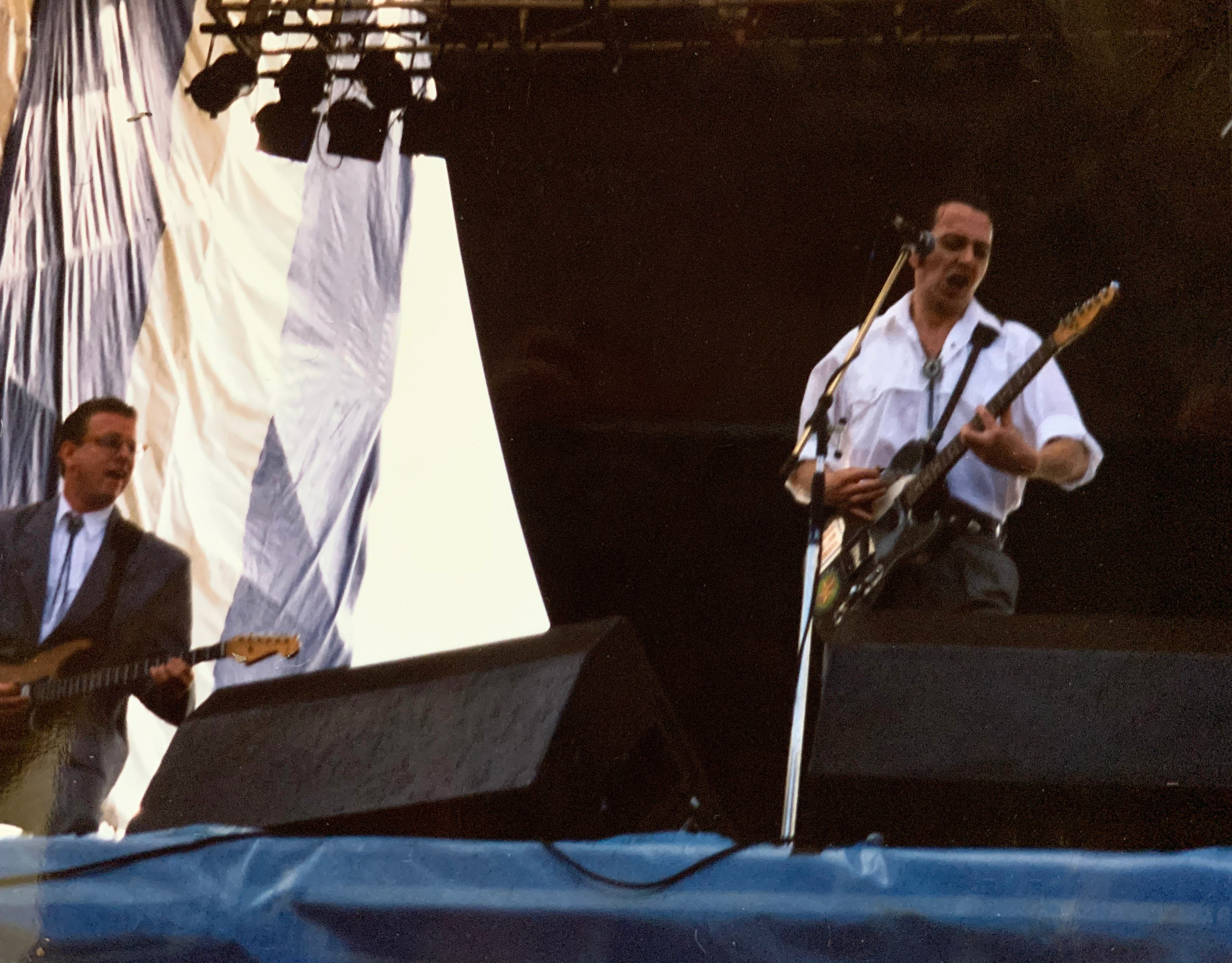
80s90sgigs